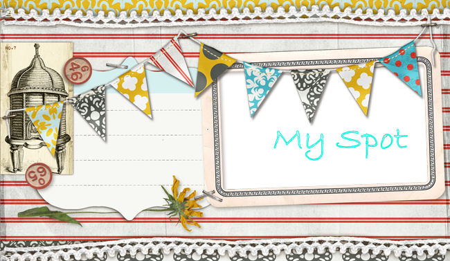
 i've been wanting to change the layout of my blog for a while but i wanted to stick with the dots, circles, spots, whatever you want to call them. i'll say spots since the name of my blog is "my spot"
 so here's four that i like and i wanted you guys to tell me what ones you like. i need a vote i guess. so it's red tree #1, green pyramid #2, brown spots #3, and jumbled spots #4. which one do you like?


I like the first one, but Im thinking that 2 or 3 is more your style (at least they are closer to your current template). :)
ReplyDeleteone of the girls that i work with voted on the red one (#1). i almost didn't put that one up because i'm not to sure what i think about it.
ReplyDeletered tree is cool! And #2 would be the bottom one... yellow/cream background with multi spots!!
ReplyDelete#2 speaks your name to me! I like #4, too. I don't like #1 and the brown is "okay..."
ReplyDeleteI like the green one!
ReplyDeleteI really like the #1. The red is vibrant and fun!!!
ReplyDeleteI like #1 & #4. Maybe I'll change mine to whichever one you don't choose. :-)
ReplyDeleteI like 1 and 4 too!
ReplyDeleteyeah thank you guys for choosing. i'm love the votes. i'm still undecided. well i can say that i probably won't choose the brown one. that one was my least fave anyways. the place that i got them from is called pyzam i think if anyone wants to look for a new layout. there's some really great ones.
ReplyDelete#1 or #4 are my votes! :)
ReplyDelete1 and 4 are my votes too!
ReplyDeleteI like 1 and four...
ReplyDeleteHoney
This is fun! Definitely, #4
ReplyDeletethank all of you for voting. i have to say that i tested the layouts out and i wasn't really all the impressed with any of them. i am probably going to coose layout #4 and test it out for a few days and you can tell me what you think. i really like #1 too but i may use that one for a blog the i am considering making for little guy. it looks cute like a little boy.
ReplyDelete